Are you interested in UI/UX design? Do you consider yourself a creative person? If so, learning Figma might be on your radar. Let’s start with a brief introduction.
Figma is a collaborative web application for interface design, with additional offline features enabled by desktop applications for macOS and Windows. According to the official statement from Figma, it supports both vector graphics and raster graphics, making it versatile for designing websites, mobile apps, graphics, logos, and more.
Getting Started with Figma
Three Key Activities in Figma
- Design: Creating user interfaces and visual elements.
- Draw (FigJam): A tool for brainstorming, wireframing, and diagramming.
- Make Slides: A newly launched feature for creating presentations.
In this blog, we’ll focus on the Design aspect, specifically website designing.
Understanding Figma's File Hierarchy
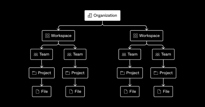
Before diving into designing, it’s crucial to understand Figma’s file hierarchy. Here’s a breakdown of the hierarchy:
- Organization: The top-level entity, usually your company or group.
- Team: Subdivisions within the organization, where collaboration happens.
- Projects: Collections of related design files within a team.
- Files: Individual design files within a project.
- Pages: Different sections within a file, helping organize your work.
- Layers: Elements within a page, including frames, groups, and shapes.
- Frame: Containers for organizing layers, akin to artboards.
- Group: Collections of layers that are grouped together for easier management.
- Components: Reusable design elements.
- Shapes: Basic design elements like rectangles, circles, and lines.
Focusing on the Basics
For now, let’s concentrate on the most essential parts:
- Pages: These are like different sections or screens within a single file. You can have multiple pages for different parts of your project, like the home page, about page, and contact page.
- Layers: Each element you add to your design (text, shapes, images) becomes a layer. Layers help you manage and organize your design elements.
- Frame: Frames act as containers for your design elements. They help structure your layout and ensure your design adapts to different screen sizes. Think of frames as artboards in other design tools.
- Component: Components are reusable design elements. Once you create a component, you can use it across your design, and any changes you make to the component will reflect everywhere it’s used.
- Shape: Basic geometric elements like rectangles, circles, lines, and polygons. These are the building blocks of your design.
Creating Your First Figma Design File
- Open Figma: Start by opening Figma and creating a new file.
- Add a Frame: Use the frame tool to define the boundaries of your design, such as a desktop screen or a mobile screen.
- Add Shapes and Text: Use shapes to create the basic layout and add text for content.
- Create Components: Identify elements that will be reused, like buttons or icons, and create components for them.
- Organize Layers: As you add elements, organize them into layers for easy management.
Moving further, let’s delve into the core concepts of design that are essential for creating visually appealing and functional interfaces:
1. Color: Understanding Color Theory
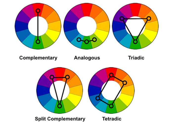
Color plays a vital role in design, influencing emotions, conveying messages, and creating visual harmony. Understanding color theory helps designers make informed decisions about color combinations and their impact.
- Primary, Secondary, and Tertiary Colors: The color wheel consists of primary colors (red, blue, yellow), secondary colors (green, orange, purple), and tertiary colors (combinations of primary and secondary colors).
- Color Harmony: Creating pleasing color combinations using analogous, complementary, triadic, or tetradic schemes.
- Psychology of Color: Different colors evoke different emotions and associations. For instance, blue often conveys calmness and trust, while red can signify excitement or urgency.
- Color Accessibility: Ensuring that color choices are accessible to all users, including those with color vision deficiencies. This involves using high contrast and considering color blindness-friendly palettes.
2. Alignment: Ensuring Consistency with Repeatability and Auto Layouts
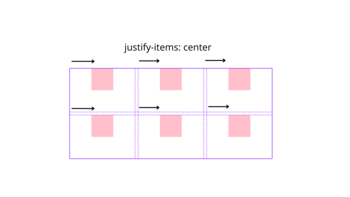
Alignment is crucial for creating a clean and organized design. Proper alignment ensures that elements are visually connected, improving the overall user experience.
- Grid Systems: Using grids to structure the layout, providing a framework for alignment and spacing.
- Repeatability: Ensuring that design elements are consistently aligned throughout the interface. This consistency helps users understand and navigate the design more easily.
- Auto Layouts: Figma’s auto layout feature allows designers to create responsive designs that adapt to different screen sizes. Auto layouts adjust the spacing and alignment of elements automatically, ensuring a consistent look across various devices.
- Guides and Rulers: Utilizing guides and rulers in Figma to align elements precisely and maintain uniform spacing.
3. Typography: Mastering Fonts, Texture, Style, and Weight
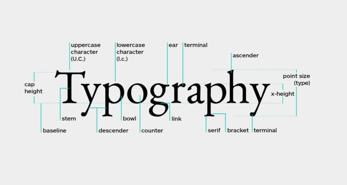
Typography is one of the most important aspects of design, affecting readability, user engagement, and the overall aesthetic.
- Fonts: Choosing appropriate fonts that match the design’s tone and purpose. Serif fonts are often used for traditional and formal designs, while sans-serif fonts are preferred for modern and minimalistic designs.
- Texture: The perceived surface quality of the text. Using different font textures can create a sense of depth and interest.
- Style: Utilizing various font styles like regular, italic, bold, and underline to highlight important information and create hierarchy.
- Weight: The thickness of the characters. Using different font weights (light, regular, medium, bold) helps in establishing a visual hierarchy and drawing attention to key elements.
- Readability and Legibility: Ensuring that the text is easy to read by choosing appropriate font sizes, line heights, and letter spacing. Readability focuses on the overall comprehension of the text, while legibility deals with the clarity of individual characters.
- Consistency: Maintaining consistent typography styles across the design to create a cohesive look and feel.
By mastering these core concepts, you’ll be able to create designs that are not only visually appealing but also functional and user-friendly. Understanding color theory, alignment, and typography will provide a strong foundation for your design work in Figma.
Next Steps
In the next blog, we’ll cover more advanced topics such as:
- Grouping elements
- Creating and managing components
- Using styles for consistency
- Prototyping interactions
By understanding and mastering these basics, you’ll be well on your way to creating professional and functional designs in Figma. Happy designing!
